Field Study of Service NSW in Store Experience
I’ve recently moved from Perth to Sydney and had to change over my WA driver’s license to a NSW license. The whole process is done in person at one of the so-called «Service NSW» centers. Basically you get there, fill out a paper form, grab a queue ticket and wait for your turn to see peeps at the counter. Easy.
Well, the luck was’t on my side that day. I waited for 45min and heard they called a ticket that was after mine. I went to talk to the person in charge of tickets and it turned out that somehow I’ve miss my call. So he gave me another “top of the queue” ticket which I waited for another 15 minutes, gave up and left the place in absolute despair and anger, feeling like a complete idiot.
Day 2. Same thing, came to the Service NSW centre, got another ticket and started my wait. Since I had to wait for almost an hour, I’ve decided to do a little field study to tell the world how bad their customer experience is.
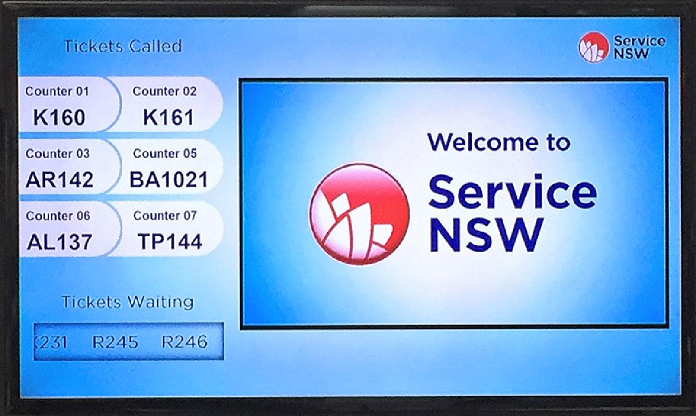
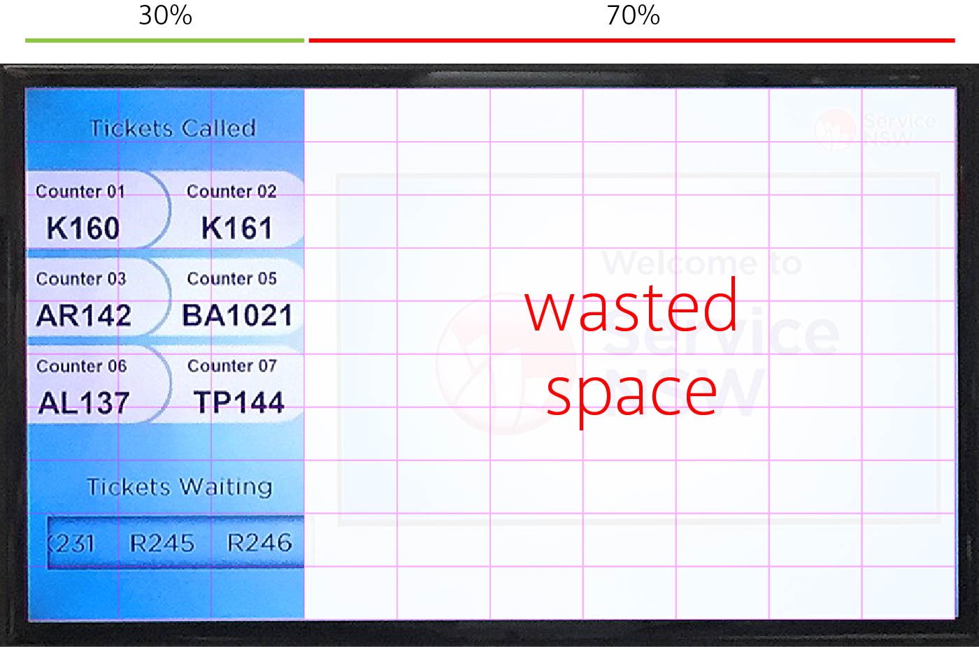
The main touchpoints and source of information referencing how the customer is progressing in the queue, are several 40 inch displays mounted to the back wall of the counter area, which is roughly 10 meters away from the customer waiting area. Unfortunately, somebody did a poor job designing that system and here is a list of major flaws I've managed to uncover:
Issue 1
70% of the display area effectively is waisted. This area is used only for a few seconds to flash the current ticket number during the voice announcement and 99% of the time shows nothing.
Issue 2
There are too many different queue codes in the system. TP139, BA1017, AL134, AR137, R226, K153, O104, OS117, SF111, X216, XG108, HB102 — 12 in total. The ticket you get will be one of them, depending on the nature of your request.
Issue 3
Design of the «Tickets Waiting» block. Tickets waiting would be the most valuable information when you just walked in and trying to estimate whether you have enough time to grab a sneaky coffee before your number comes up.
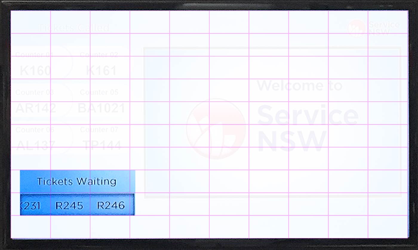
At the time there were 69 tickets in the queue: X, AL, TP, AL, X, K, AL, X, R, X, R, X, R, R, XR, R, R, OS, AL, XG, X, TP, R, AR, K, HB, O, SF, X, TP, AL, R, OS, AR, K, SF, X, AL, TP, R, K, SF, TP, AL, X, R, R, X, AL, TP, R, AL, X, TP, R, R, X, R, X, R, R, R, X, TP, AL, R, AR, K. Only 3 tickets out of 69 can actually fit in the tiny little box at once and it continuously scrolls from left to right as an attempt to show them all. It takes about 10 seconds for 3 tickets to fully scroll across and reveal the next 3 numbers, or 4 minutes to do the lot.
Issue 4
Poor differentiation between queue codes. Most ticket codes share same letters in them. The most frequent are the A and R. Combined, these letters appear in 50% of all tickets called. My ticket had both — AR142.
Issue 5
Lack of contrast between text and background. Extremely faint, extra light font weight and black text on dark blue background makes it, virtually impossible to read from where customers are sitting.
Issue 6
Design of the «Tickets Called» area
Tickets Called range from 8 to 12 in any given moment in time which are displayed in batches of 6, continuously alternating between each other. Due to a larger and thicker font, it’s a lot more prominent and can be easily mistaken for tickets waiting.
…
This time it’s taken only 45 min before the call. Spent about 2 min at the counter, then another 10 waiting for person to process the paperwork and voila!
Next post will be about how we can improve the current design, stay tuned!